Roadside 3D, road signs & fragment map style
How we extended the symbolic map for automotive: believable roadside detail, 3D signage tied to real road data, and a fragment-ready style layer that scales across regions.
Context
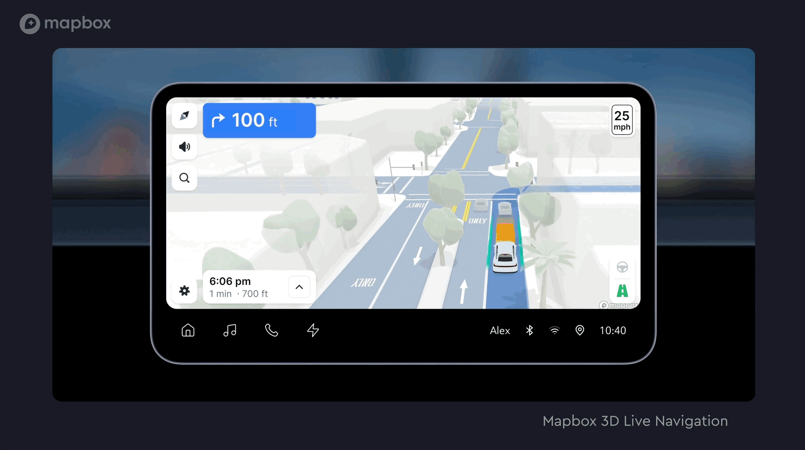
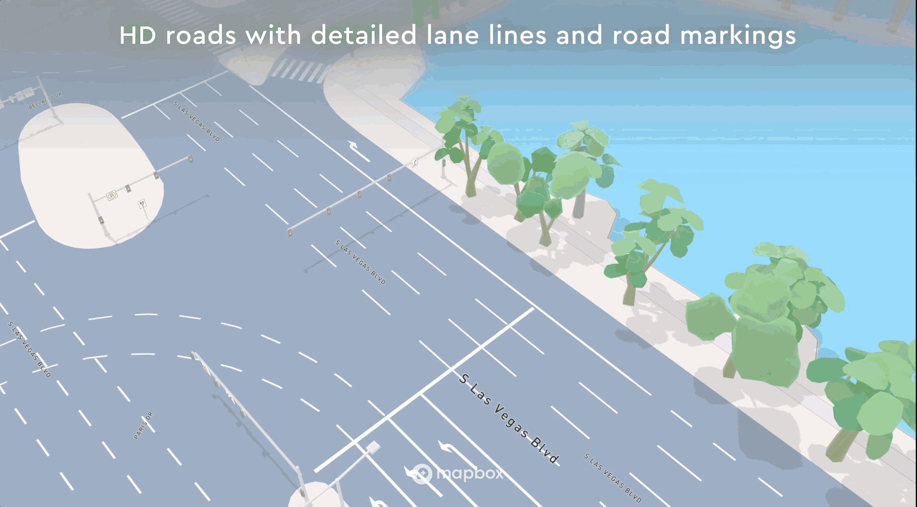
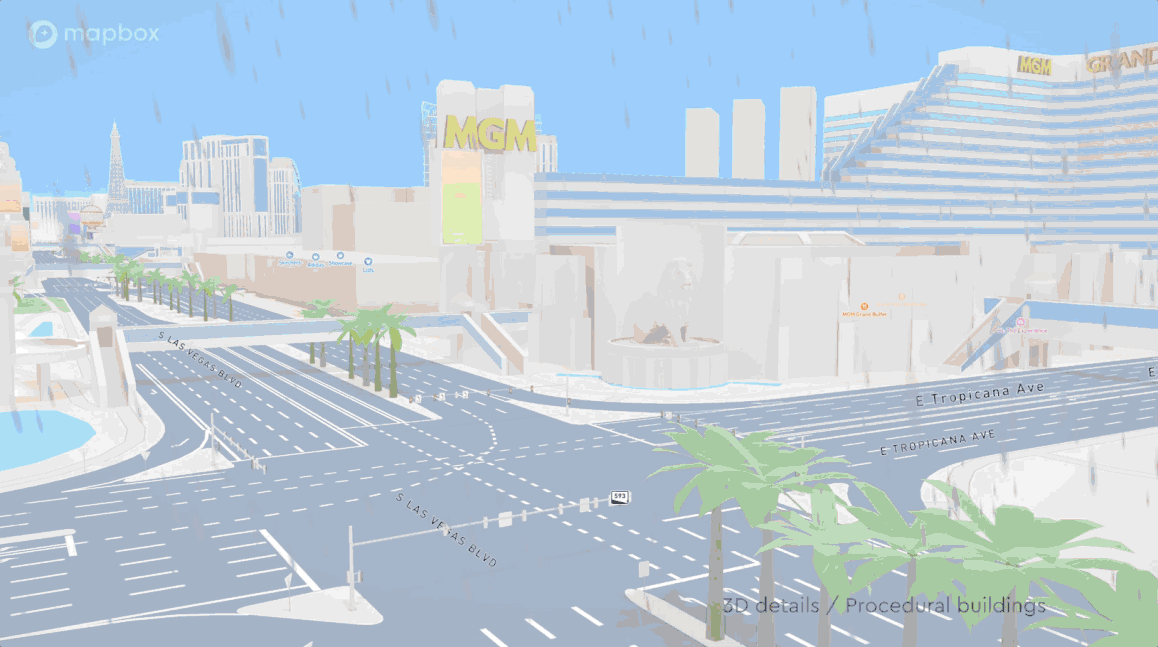
For automotive customers, the product story is the map itself: current data, readable context, 3D where it helps, and a symbolic treatment that stays legible at a glance. We push that “symbolic realism” direction so one look at the screen still explains what is happening on the road, not a decorative toy layer.
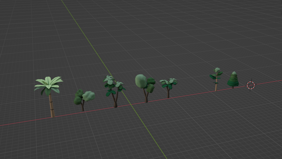
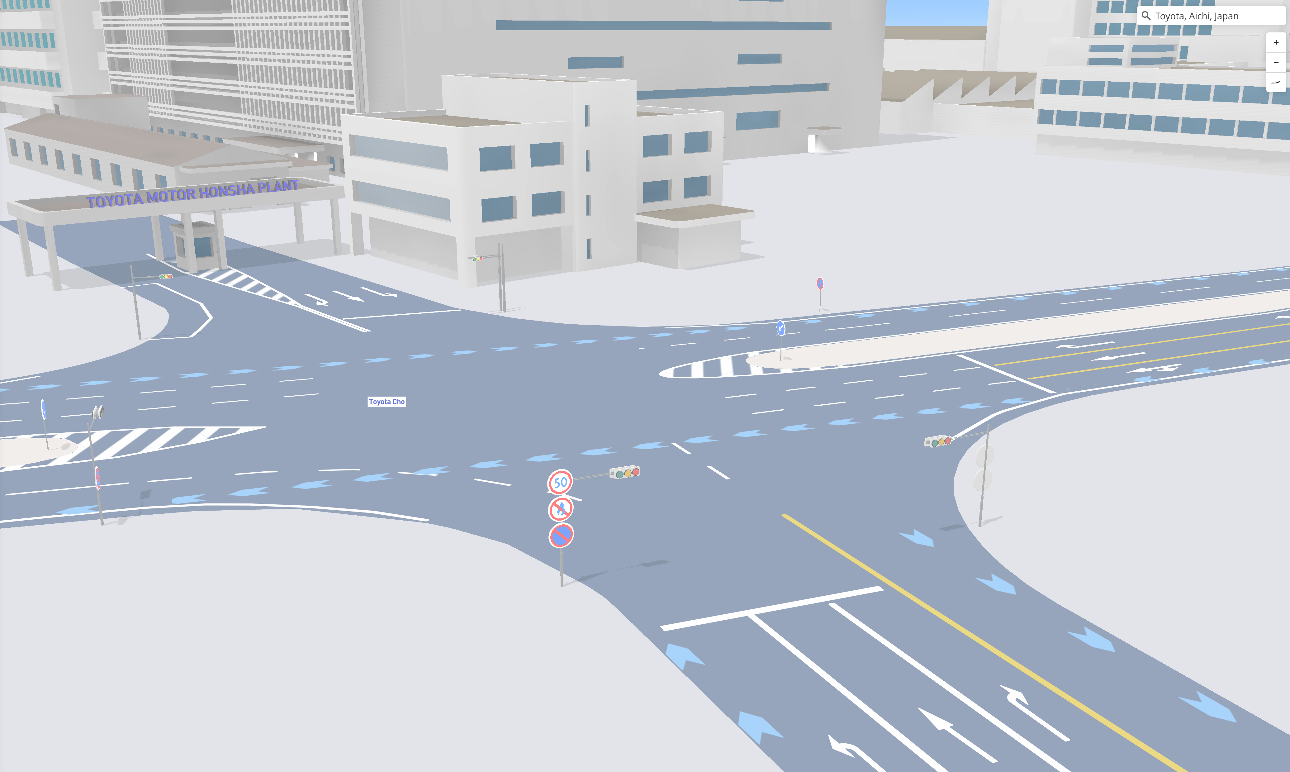
We had already built a strong baseline with 3D buildings and related features. As HD road work advanced, it became realistic to place small roadside objects along real road geometry: not only trees, but signs, cones, barriers, and other infrastructure that matches what data says is there.
Early limits
In earlier experiments, small props without a convincing road “eye” or road-locked placement felt ornamental and disconnected. Once HD roads and better alignment with the drivable path existed, we could reason about what belongs next to the lane and how it should read in navigation scenes.
Readability
The question was never “more meshes,” but whether each prop anchors to the same mental model as the driver: lane, shoulder, height, and distance. Without HD road context, that relationship was guesswork.
From skepticism to a clear goal
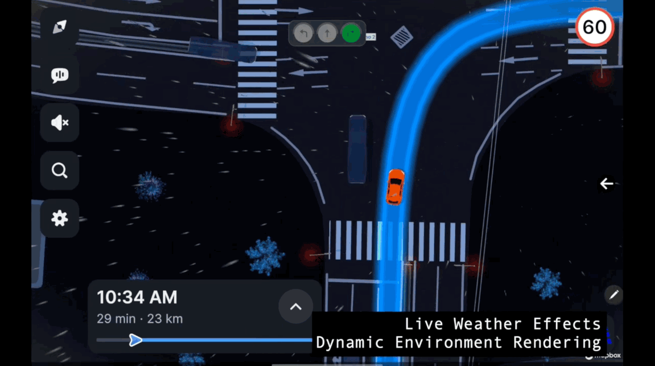
At first I was cautious: in real driving, eyes belong on the road ahead, not on a busy map. The team still asked whether a richer roadside could help aesthetically: a road that feels inhabited and calm, not a flat gray strip with lane markings only. Vertical signage and light infrastructure make the scene feel alive, especially in dark or low-contrast UI states, without pretending to be a simulator.
We dropped a few sign types onto routes our customers and internal drivers actually use. Feedback turned fast: people noticed cones, temporary detours, and “real” traffic situations. That validated the direction: symbolic, but grounded in what telemetry and road data could support.
Scoping what to show
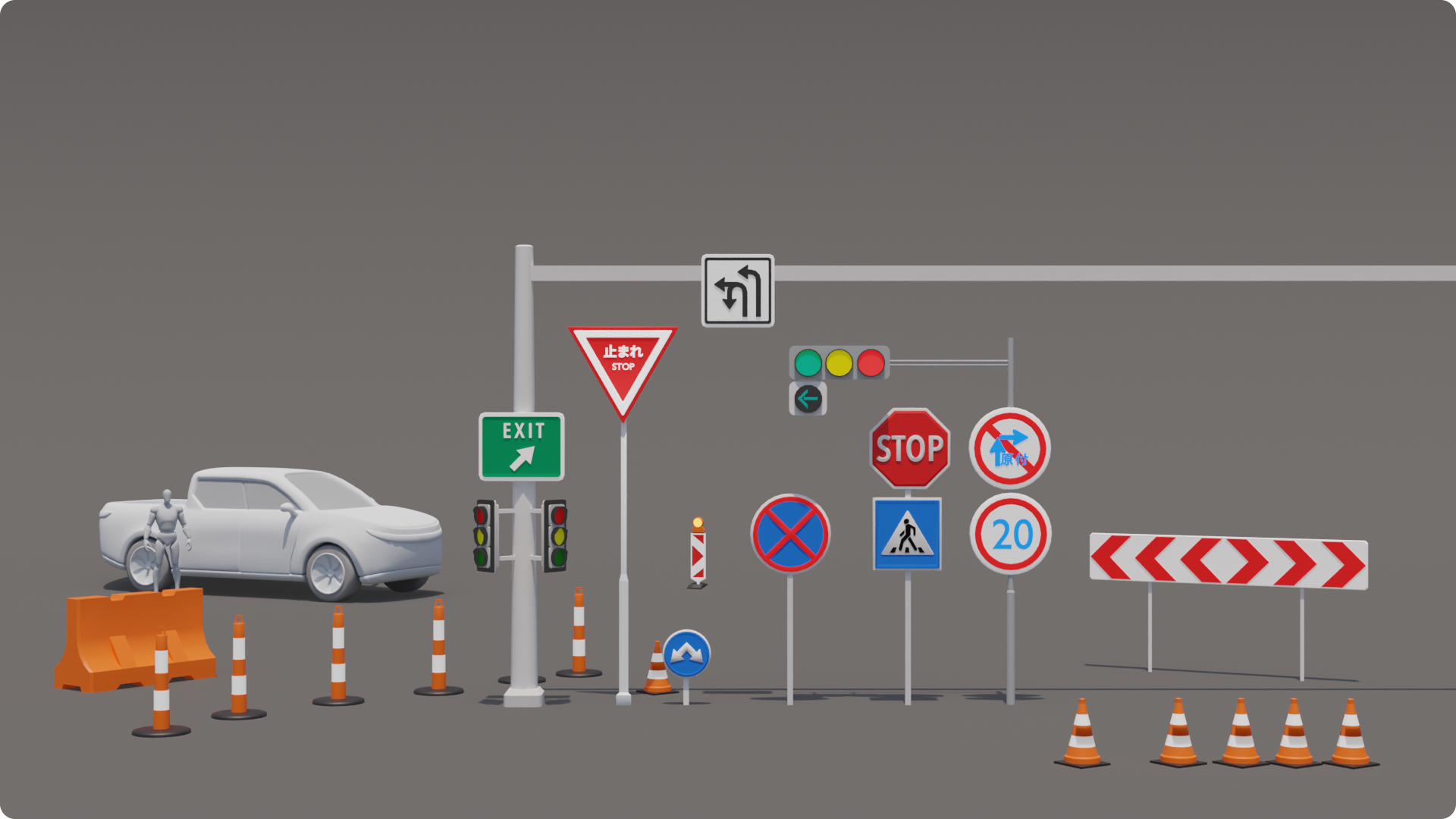
Roadside reality is noisy: regulatory signs, information boards, advertising, odd combinations. We needed a list that was detectable in data, mappable to stable visuals, and worth the validation cost. I focused on which inputs were high quality, which could be interpreted into geometry without constant manual fixes, and which categories actually matter for navigation storytelling versus visual clutter.
Filter by signal, not by taste: if we cannot trust the tag in production, it does not ship in the default catalog.
The first broad pass looked busy. We tightened the set: fewer categories, clearer rules, and a path toward automatic placement where the pipeline allowed it.
Scope
Every category needed a data contract: minimum quality, expected failure modes, and whether art would carry a fallback when telemetry disagreed with the artist’s guess.
Japan-first MVP
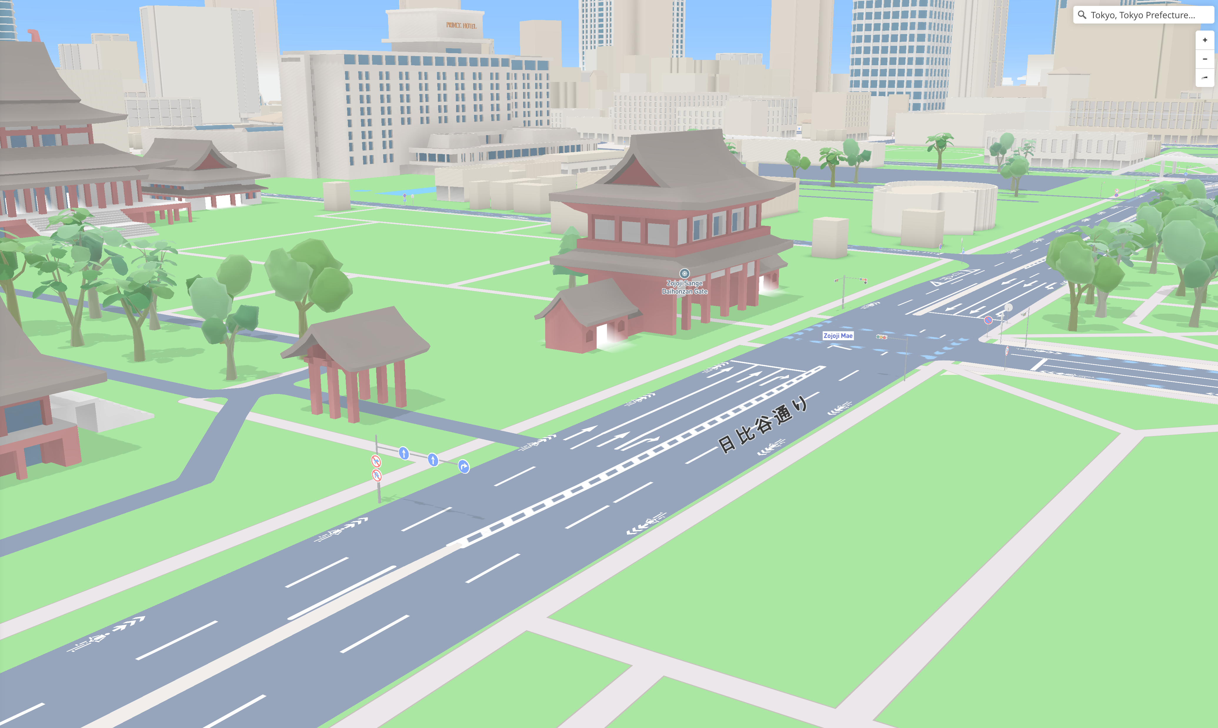
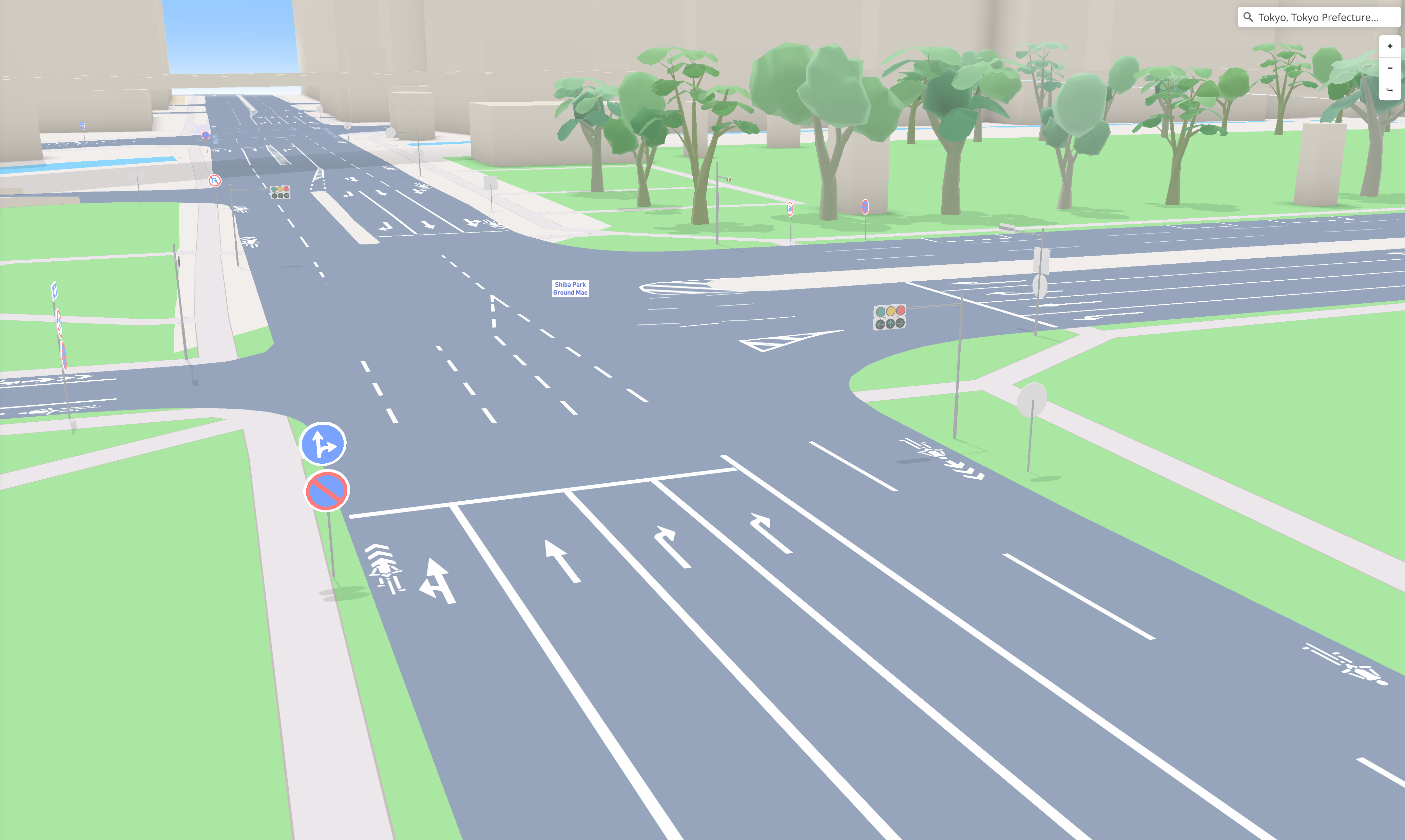
We started coverage in Japan because the sign system was comparatively uniform: fewer awkward add-on plates, clearer pole-mounted layouts, and less of the gantry-heavy mix that complicates 3D rigging. The MVP was blunt but honest: pull data in, place fully modeled signs including supports, run a couple of real routes, and see what broke.
That pass proved we needed more freedom to approximate real road situations on the map, not just isolated icons. That pushed the next step: a real mapping system for tags, storage, and how data specialists describe the world so rendering stays predictable.
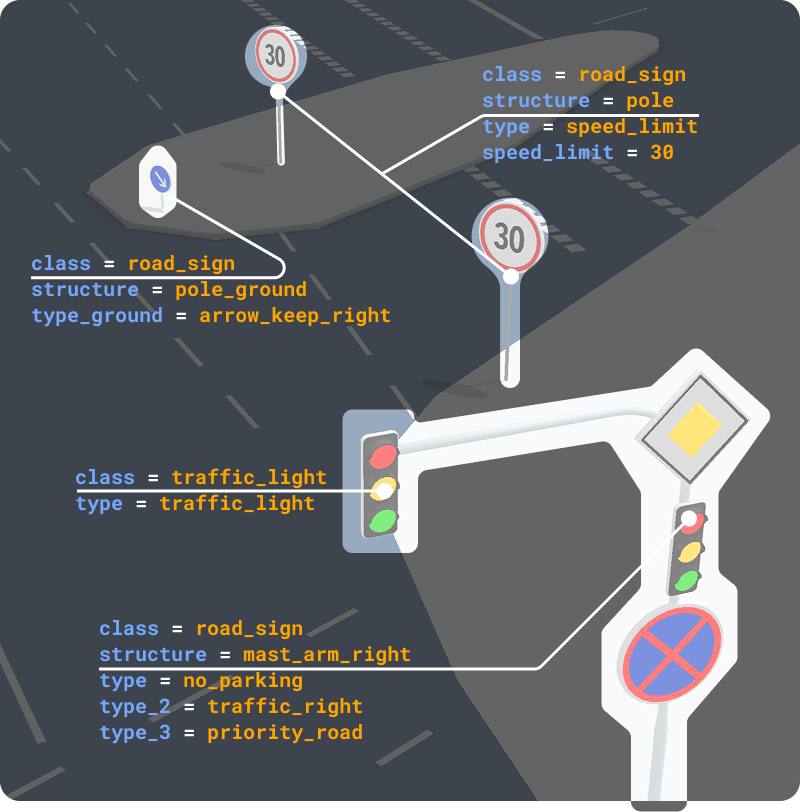
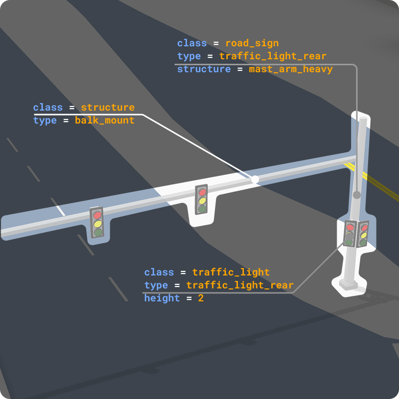
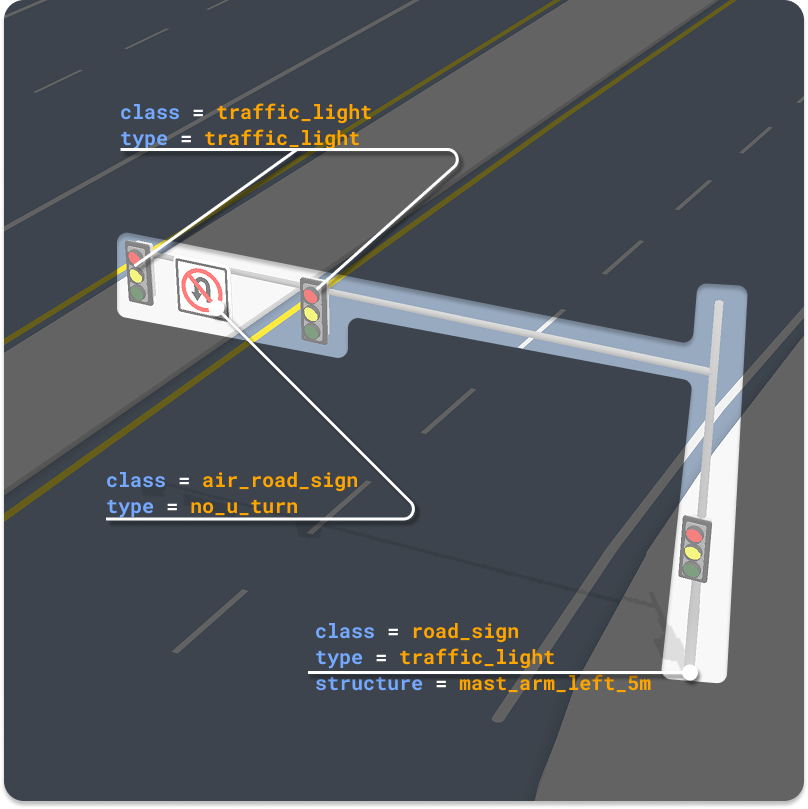
Tagging, data shape, and style
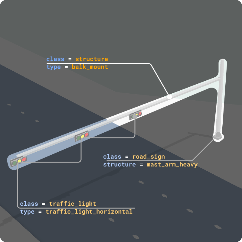
I designed a structure for how tags map to assets, how records should be stored, and how downstream teams could interpret the same fields for visualization today and for future work (interchanges, grade changes, more complex layouts). Alongside that, we defined how 3D assets hook into those tags, which style expressions read them, and how the fragment map style exposes the roadside sign layer next to the rest of the basemap.
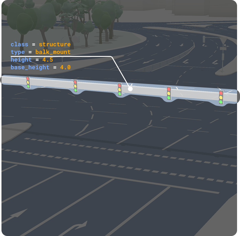
Data → style
The fragment style does not “guess” props: it evaluates expressions against the same fields the data team edits. That keeps QA and demos aligned.
The outcome is not only a one-off MVP: it is a pattern the team can extend when road data and customer scope grow.
Regional assets and coverage
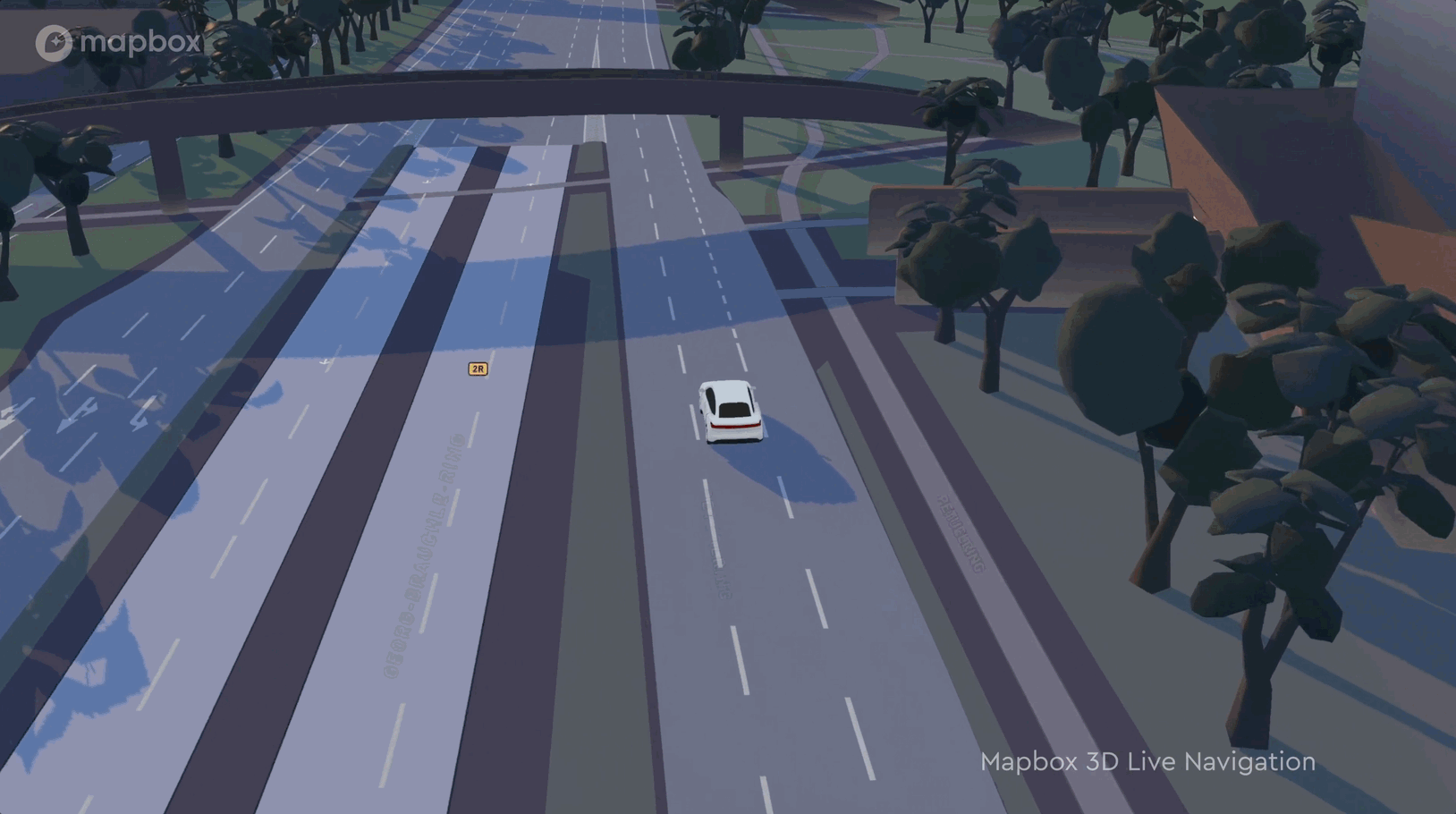
From that foundation we grew a larger asset set, including Europe and North America alongside Japan, with local visual rules where regulation and hardware differ. Coverage follows a simple rule in practice: where we have the road and attribution data our automotive programs care about, we can justify placing the matching 3D treatment on the route.
For a partner demo we also touched a corridor in Abu Dhabi when the scenario required it. The same system idea applied: regional look, same data contract.
Where it ships
This work lives in the automotive and advanced demo lane: it is not a generic consumer toggle for every Mapbox app. A full production rollout ties to large programs that need that level of road fidelity. Meanwhile, on internal and partner drive demos, we use the feature to show how symbolic maps can still feel grounded and road-true when data and art direction align.
Outcome
From a noisy first list to a defined data contract, a visual catalog across key regions, and a fragment style that knows how to read roadside signage: a roadmap from MVP routes to a structure the org can maintain. For me it sits next to the broader roadside library work: same fragment mindset, but here the hero is the relationship between road truth, 3D readability, and symbolic map design for people who ship navigation in vehicles.