Mapbox 3D buildings
From first concepts and technical specs to a staffed pipeline and global coverage: turning 3D buildings into something Mapbox could ship and customers could trust in navigation and automotive.
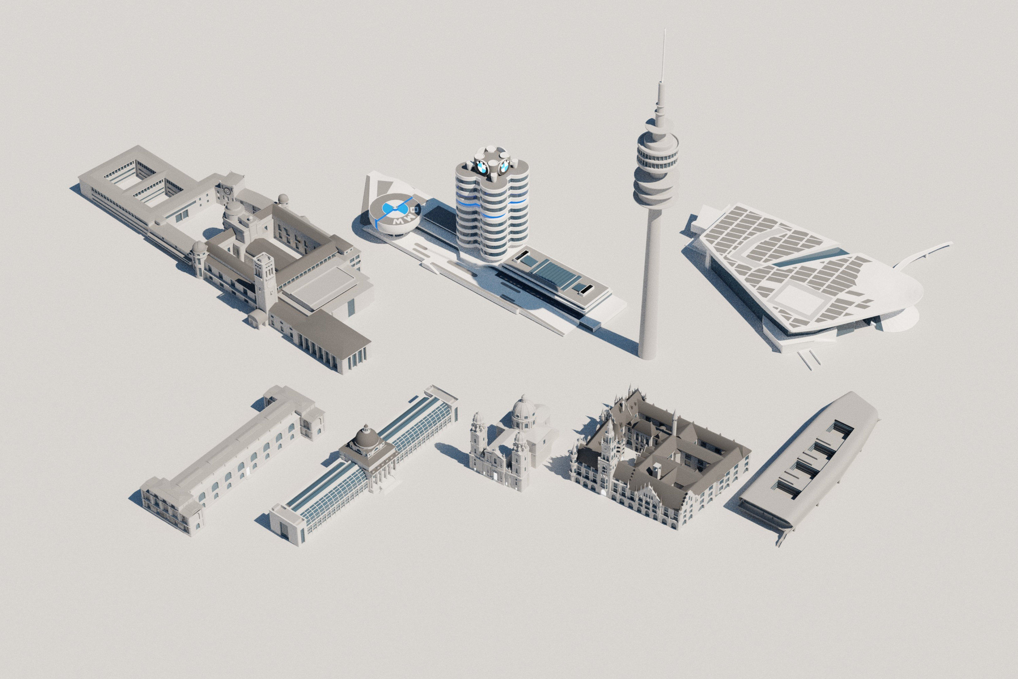
Mapbox Standard in motion: lighting, landmarks, basemap. Open on Vimeo if the player does not load.
Context
Mapbox maps and location building blocks ship inside other companies’ products. The 3D layer had to feel credible on embedded and automotive UIs: clear for wayfinding, calm for long sessions, and consistent as coverage grew without fighting the rest of the basemap.
We benchmarked perception and coverage against Apple Maps, Google Maps, HERE, and similar products. That lens stayed with us in design, docs, and rollout planning, and it shows up later in Mapbox’s own posts on Standard and global landmark coverage.
What I owned first
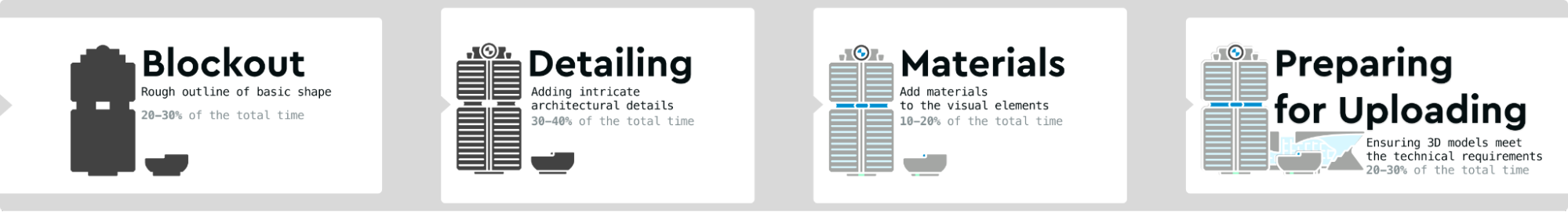
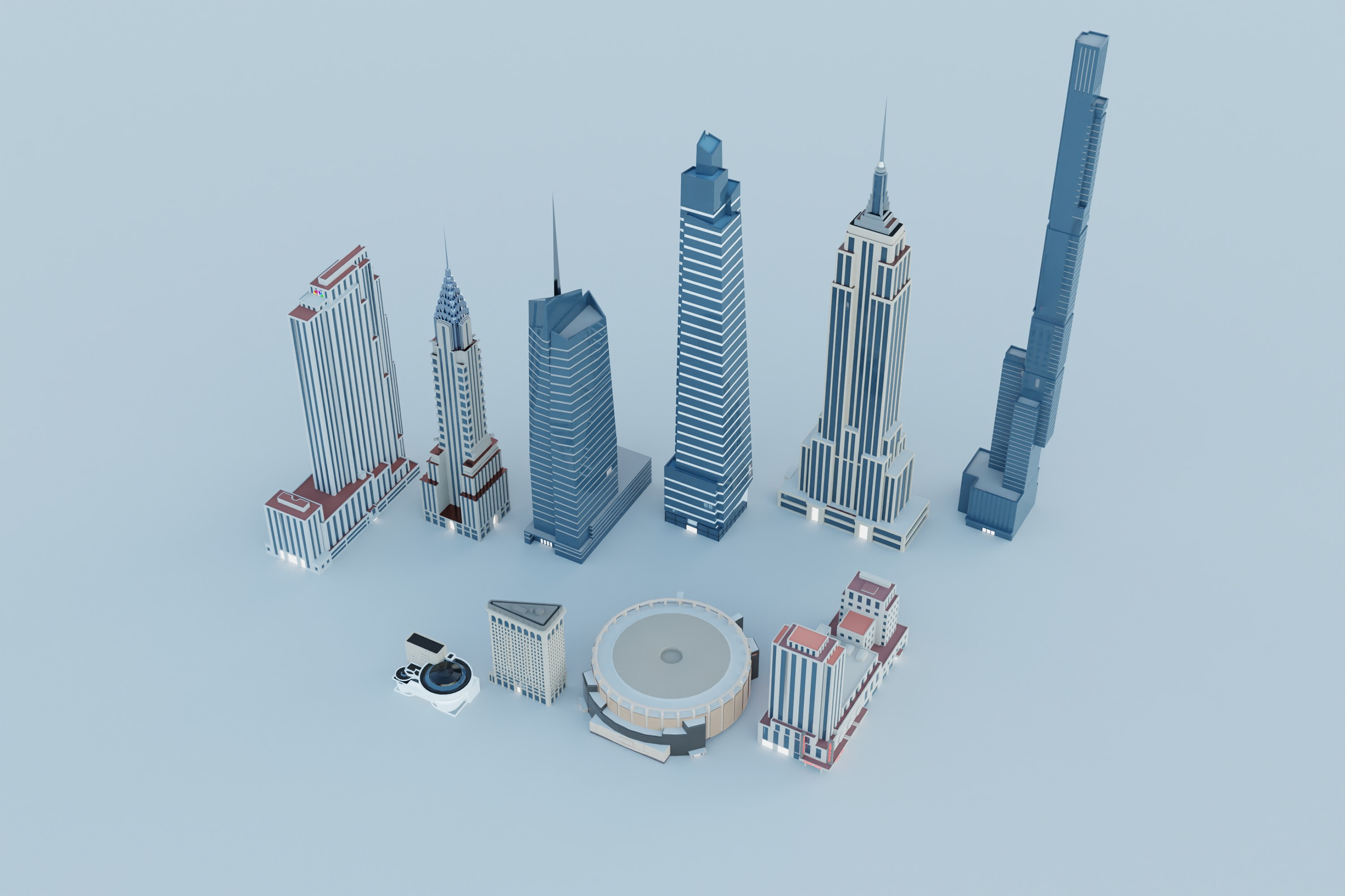
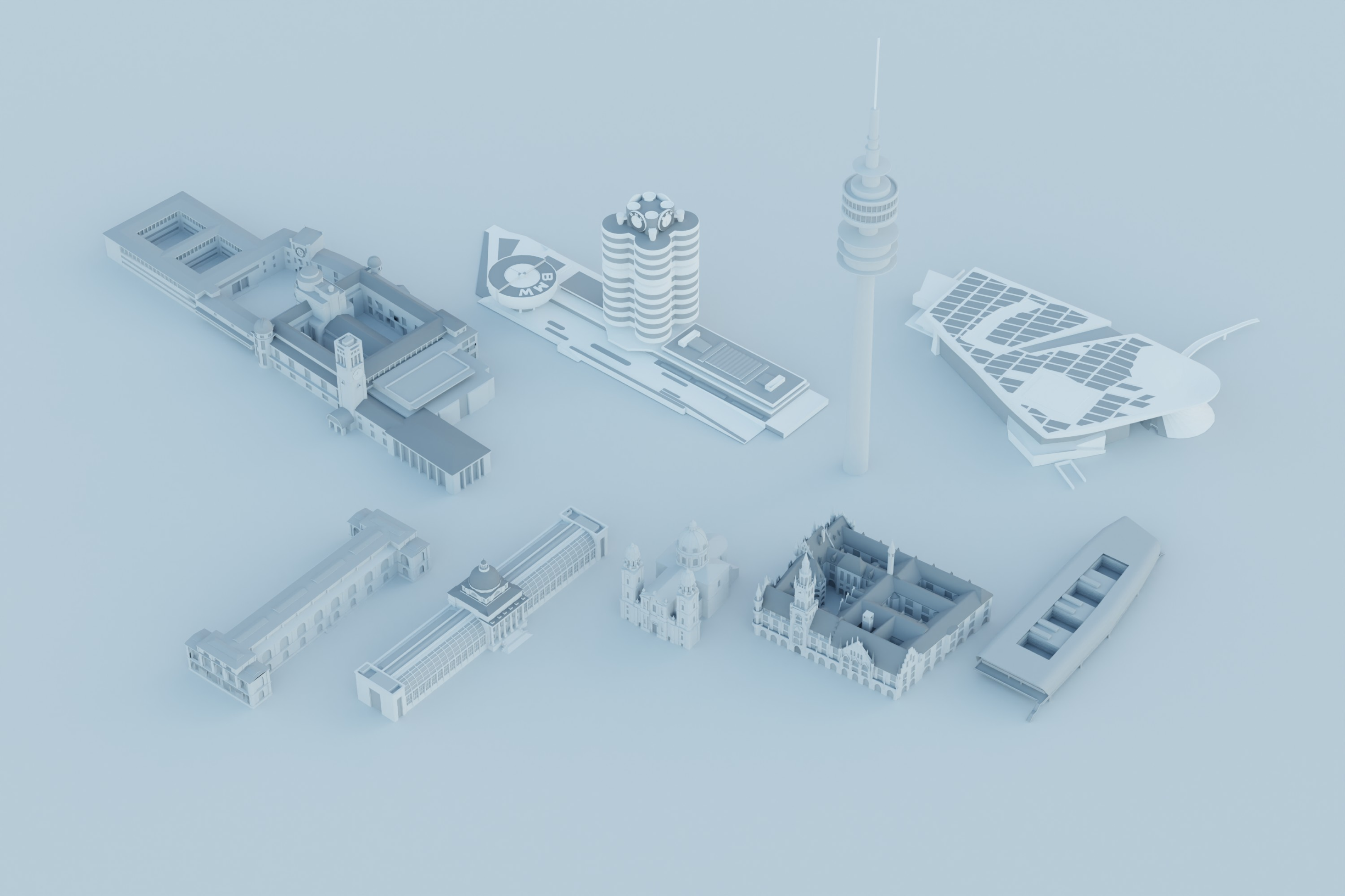
I joined while the story was still open. I sketched directions and wrote the first design docs: how 3D should behave on the map, how materials and silhouettes read at different zoom and motion, and what “on brand” meant day to day. That work sat in the same symbolic-realism direction Mapbox later published in its 3D basemap design article.
In parallel I wrote the technical side: geometry simplification for tiles and performance, how models fit Mapbox constraints (mesh budgets, naming, renderer and data stack), and clear definitions of “done” for QA and handoff. One source of truth so artists, engineers, and managers did not rely on hallway decisions.
Problem
We inherited uneven geometry and sources without a system that could grow. We needed a shared visual language, acceptance criteria, and a path to city coverage that could keep pace with major map products, without burning the team or eroding quality.
Documentation built for scale
After requirements, checks, and resources were clear, the constraint was execution: could a new hire or partner follow the same rules and ship the same bar? I invested in documentation written for speed and scale, so new coverage meant running a known process instead of negotiating exceptions each time.
That foundation supported a customer-facing outcome: not a single hero city, but a system built to roll out broadly and stay maintainable.
Team model and growth
Early on we had to choose a production base: freelancers, contractors, in-house staff, or a mix. We started with motivated people inside the company who had little 3D background and trained them into production artists. Several are still contributing years later.
After the first wave held, we scaled. I became the first team lead for 3D artists once the technical rails existed: priorities, quality, coordination with map and product designers and managers. As more product designers joined the program, we widened both features and geography together.
Mapbox Standard and launch readiness
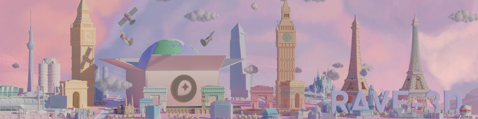
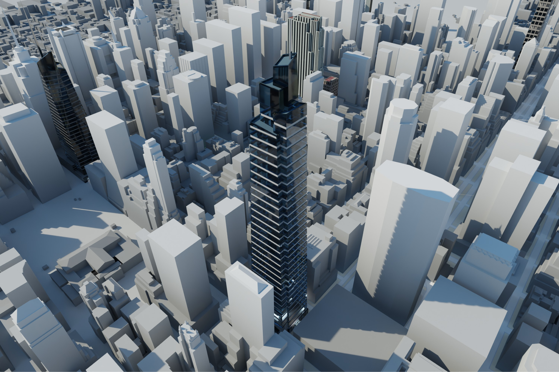
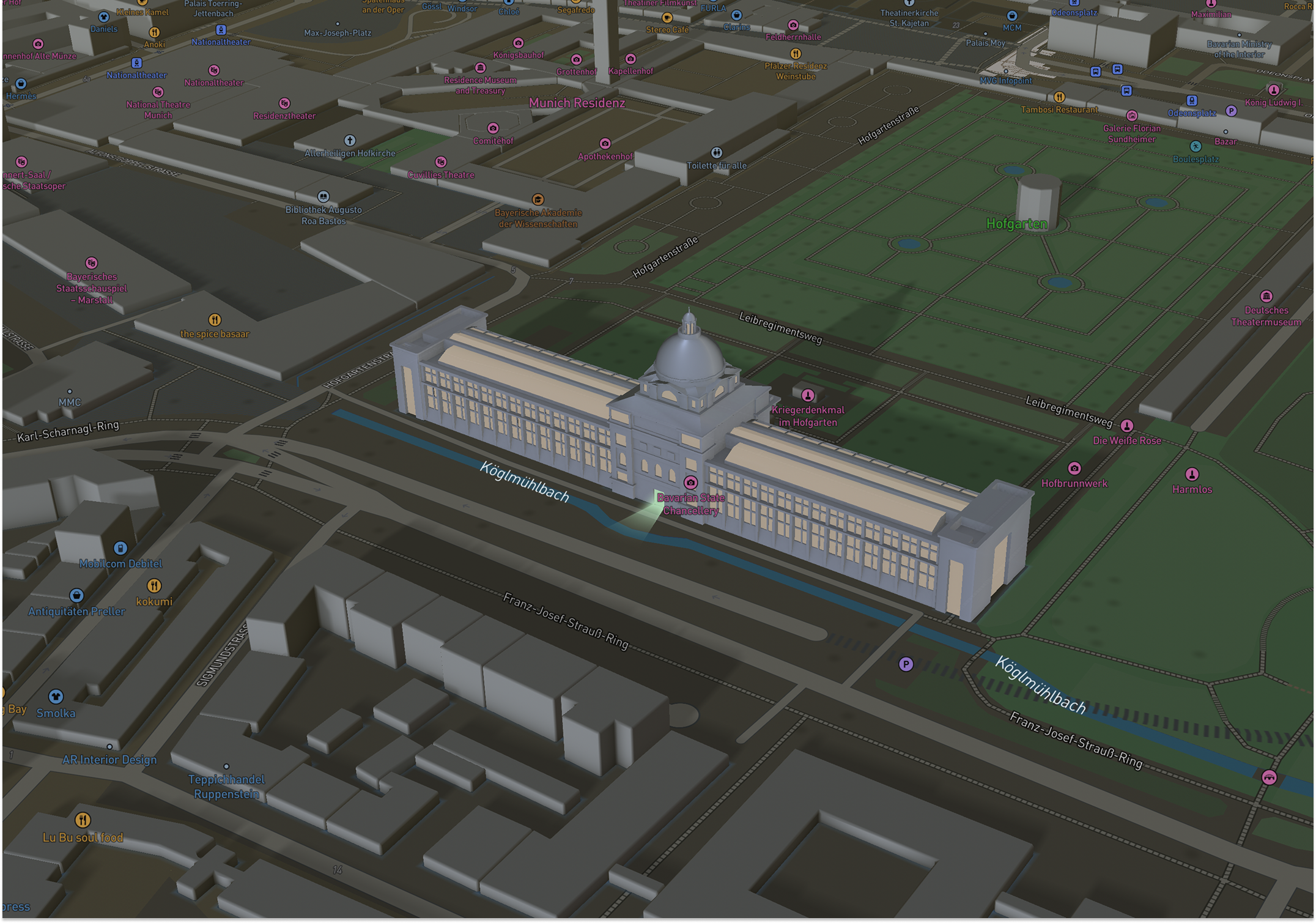
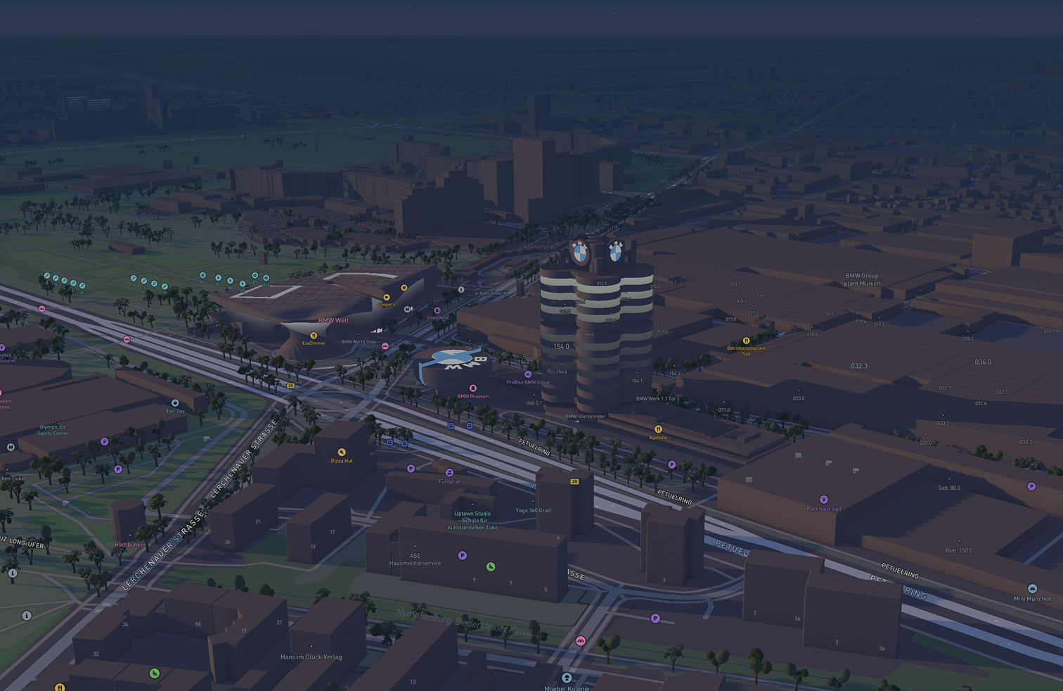
Mapbox Standard launched as the core style: a symbolic, performant 3D environment with dynamic lighting (day, night, dusk, dawn), landmarks that react to light, and a basemap that stays legible while custom data sits on top. Public positioning covered wayfinding, automotive, travel, delivery, and any product that needs life in the map without noise.
When that style and the first public wave of landmark content shipped, we were not improvising. Artist workflow, review and QA, manager operations, and planning rhythms were already running. I worked in that operations layer as well as in craft, so releases felt like running a system, not a rescue.
Day to day that meant tight work with Mapbox map and product designers, engineering and rendering limits, and the 3D artists on the floor. It was the largest end-to-end project I had led to that point in my career, and one I am still proud of.
Symbolic realism, not a digital twin
The basemap chose symbolic realism over photorealism. Landmarks stay recognizable and hierarchical so roads, labels, and customer data stay readable. Mapbox’s product design article explains the trade-off: hierarchy for the user, runtime lighting instead of baked materials where it helps performance, and 3D that can step down to 2D when the use case needs it. Our models had to live inside that frame.
Owen Powell (product design) ran color directions for what could ship in Standard alongside the 3D buildings: full-color city explorations, strict monochrome, and monochrome with selective brand marks. The goal was a default map that felt premium without fighting customer layers.
Scale in the open
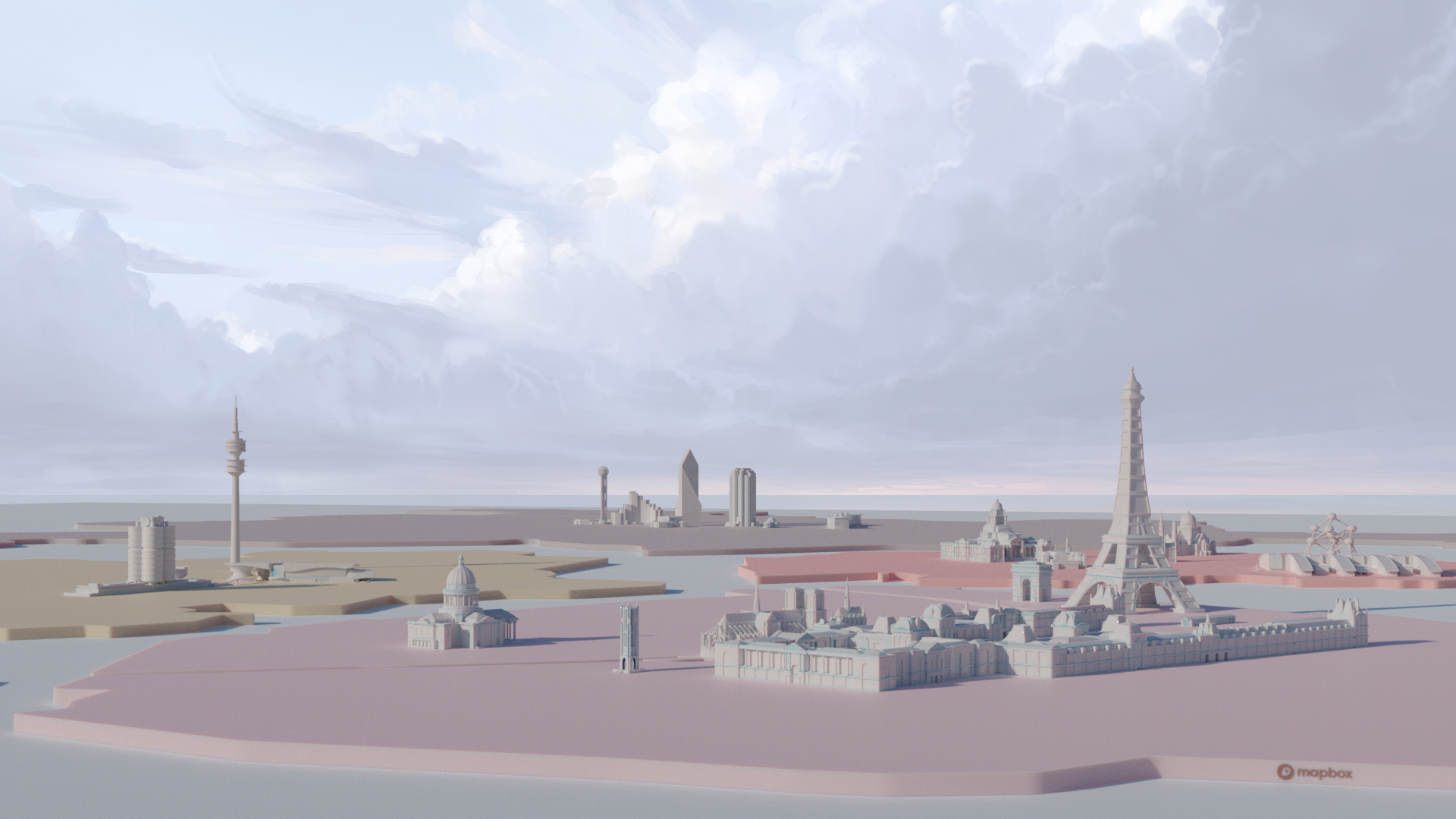
Coverage is the proof the pipeline worked. Mapbox describes a growing catalog of custom landmark models across global cities, plus airports and major stations, so dense urban areas are supported by a program rather than a one-off demo. The global cities and landmarks post covers how teams pick cities, balance density, and design landmarks for real navigation zooms. That is the same class of operational and design problem our docs and team structure were built for. City and model counts in that post change over time; see Mapbox for the latest figures.
Outcome
The output is a basemap teams ship on: 3D that holds up in navigation, automotive, and embedded products, with production muscle behind it. Mapbox packages maps, Standard, and SDKs as the stack developers and brands give to end users. The landmark layer is part of that stack.
References
Mapbox sources I use when explaining product context and scale:
- Video: Mapbox Standard (Vimeo)
- Mapbox Maps (product hub)
- New 3D environments enhance wayfinding and location awareness (Standard and 3D, Aug 2023)
- Global cities with 3D landmarks (coverage and design process)
- Why Mapbox chose symbolic realism for the 3D basemap (design rationale)